When men’s grooming brand Harry’s launched its first product, it had already built an email list of nearly 100,000 people.
What’s more, they built this list in just ONE week!
Want to replicate this success?
In this post, we’ll share some excellent coming soon page examples, as well as some tips and tools for creating one of your own to build brand awareness.
Table of Contents
What Is A Coming Soon Page And Why You Need One
A coming soon page (also known as an under construction page) is a placeholder that sits on your website before your new website or product is ready. Essentially, it’s a temporary homepage to tell any website visitors that your site/product is being built and a way to capture leads before your launch.
It’s one version of a squeeze page with a specific purpose (ask visitors to wait — or better, join your email list while waiting) at a specific time (before your website/product is ready).
If you wait until your product is ready to sell, you’ve missed out on huge opportunities to grow your brand, get feedback, and build an audience.
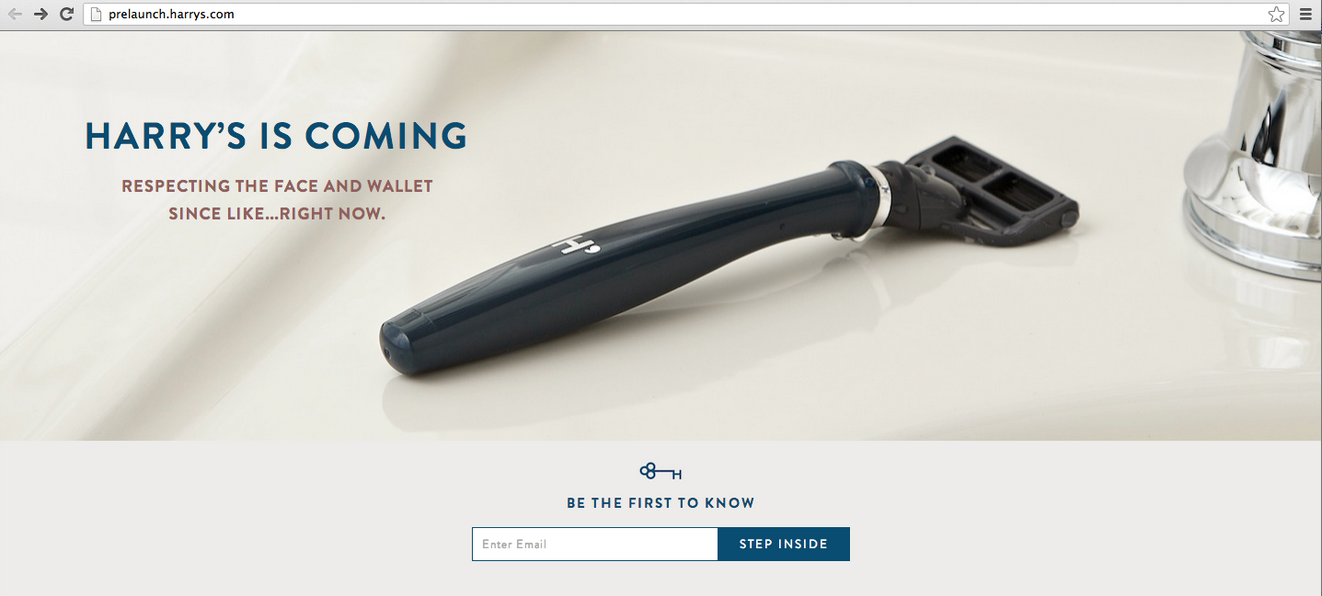
Here’s how Harry’s co-founders Jeff and Andy created a simple coming soon page that encouraged people to sign up.
This is what it looked like:

But it didn’t stop there. Once someone had left their email address, they got a shareable link to invite others to sign up to Harry’s waiting list. By inviting friends, people could earn free products.
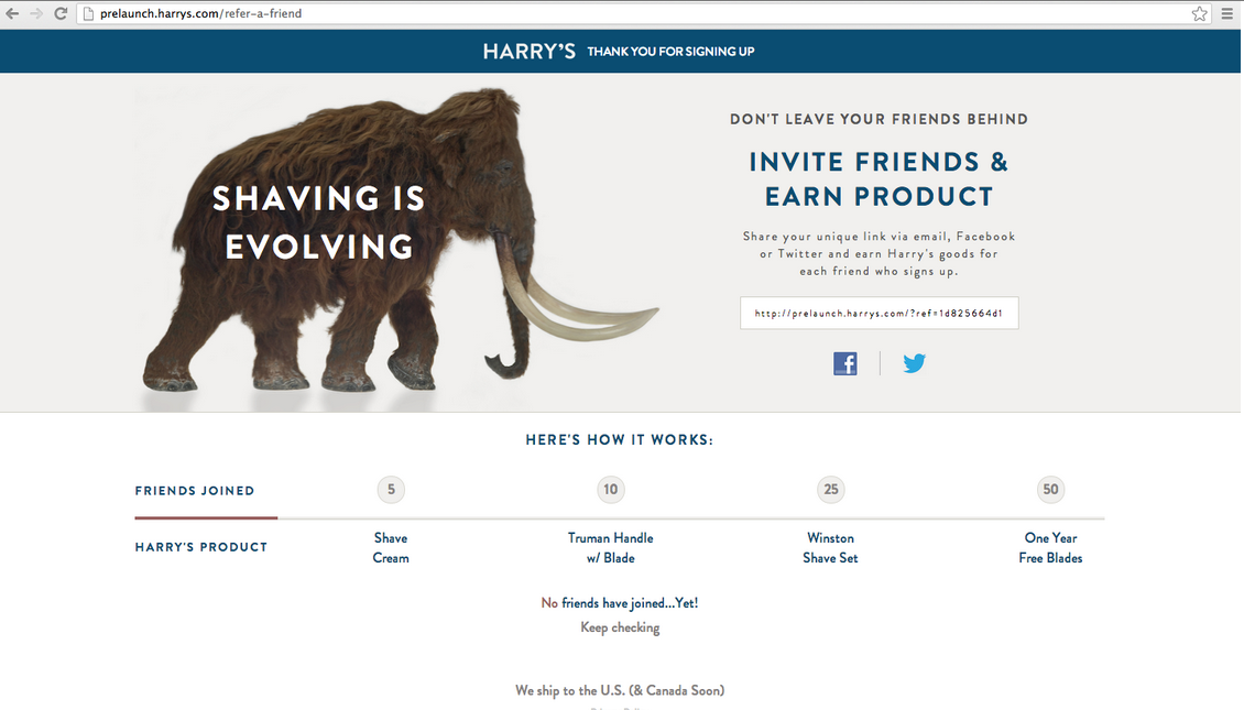
Since its launch, Harry’s has been a runaway success. But it all started with a great coming soon page.
If Harry’s co-founders had waited until launch to start promoting their brand, they would have missed out on nearly 100,000 potential customers.
Here are a few reasons you should have a coming soon page:
- It sets expectations: Many under construction pages tell visitors when the site will launch give the visitor enough information to understand what your site (or product) is about.
- Test your messaging: It’s hard to get your brand messaging right the first time around. With a coming soon page, you can try a few different messages and see which convert best before your launch.
- Generate leads: We’ve covered this a little above, but a coming soon page is a great way to capture some prelaunch leads.
Benefits of a Coming Soon Page
A coming soon page offers numerous benefits for businesses and website owners. By creating a coming soon page, you can build anticipation and excitement for your upcoming launch. This pre launch strategy helps create a buzz around your brand and product, making your audience eager for the big reveal.
One of the key advantages is the ability to collect email addresses from interested visitors, allowing you to build a pre-launch list. This list can be invaluable for marketing efforts once your site or product goes live. Additionally, a coming soon page can drive traffic to your social media accounts, increasing engagement and helping you build a community even before your official launch.
A well-designed coming soon page also provides a professional and polished image for your brand. It shows that you are serious about your upcoming launch and are taking steps to ensure everything is perfect. Moreover, it creates a sense of urgency, encouraging visitors to sign up for updates to stay in the loop.
From an SEO perspective, having a live coming soon page means search engines can crawl your site, which can improve your website’s ranking even before it fully launches. This early start can give you a competitive edge and help you attract more visitors from the get-go.
What Makes A Great Coming Soon Page
Though every coming soon page design is a little different, the best ones share a few traits that you shouldn’t ignore.
The best coming soon pages feature three key elements:
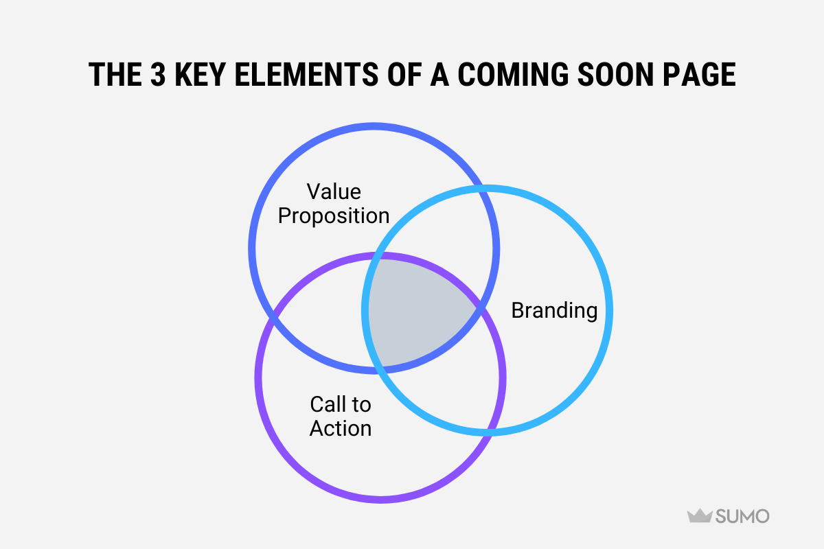
- Value proposition: Tell visitors what problem you’re solving for them and give them a reason to care.
- Branding: Always include your brand name and logo on your under construction page.
- Call to action: Make it clear to every visitor what you want them to do once they land on your page (more often than not it’s to sign up to a mailing list).
Key Elements of a Landing Page
A great coming soon page should include several key elements to ensure it effectively captures interest and drives engagement. First and foremost, a clear and concise headline is essential. This headline should communicate your value proposition and immediately tell visitors what problem you’re solving for them.
Next, a compelling and engaging message that resonates with your target audience is crucial. This message should be brief but powerful, giving visitors a reason to care about your upcoming launch. Alongside this, a prominent call-to-action (CTA) should encourage visitors to sign up for updates or take a specific action, such as following your social media accounts.
The design of your coming soon page should be visually appealing and reflect your brand’s identity and style. A countdown timer can be a great addition, creating a sense of urgency and anticipation for your launch. This timer can help build excitement and encourage visitors to keep checking back.
Including social media links is also important. These links connect visitors to your social media accounts, allowing them to follow you for updates and behind-the-scenes insights. Finally, a one-click email subscription feature makes it easy for visitors to sign up for updates, ensuring you capture as many leads as possible.
BONUS: OFFER AN INCENTIVE
This isn’t a must-have, but if you want to really encourage people to sign up to your list pre launch, you could offer an incentive. This could be:
- Discounts: Everyone loves a deal, and if someone has landed on your coming soon page, there’s a good chance they have an interest in what you’re offering. Incentivize them to leave their email address with a discount on their first purchase.
- Giveaways: Running a giveaway is a fantastic way to encourage people to share your landing page and drive word-of-mouth traffic. (KingSumo is a great tool for this.)
- Free shipping: Shipping can be one of the main reasons people abandon shopping carts. Try to generate leads by offering free shipping to your first 1,000 signups.
- Case studies: If you’re selling software, a course, or any services, you could offer a free case study to all signups, giving them a teaser of what you will be selling when you launch. This is a great way to build excitement and prove the value you’ll be providing before launch.
20 Real-World Coming Soon Page Examples
So what does a good coming soon page look like? Here are 20 examples from real businesses including Apple, Wistia, Buffer, and Robinhood.
1. APPLE TV+
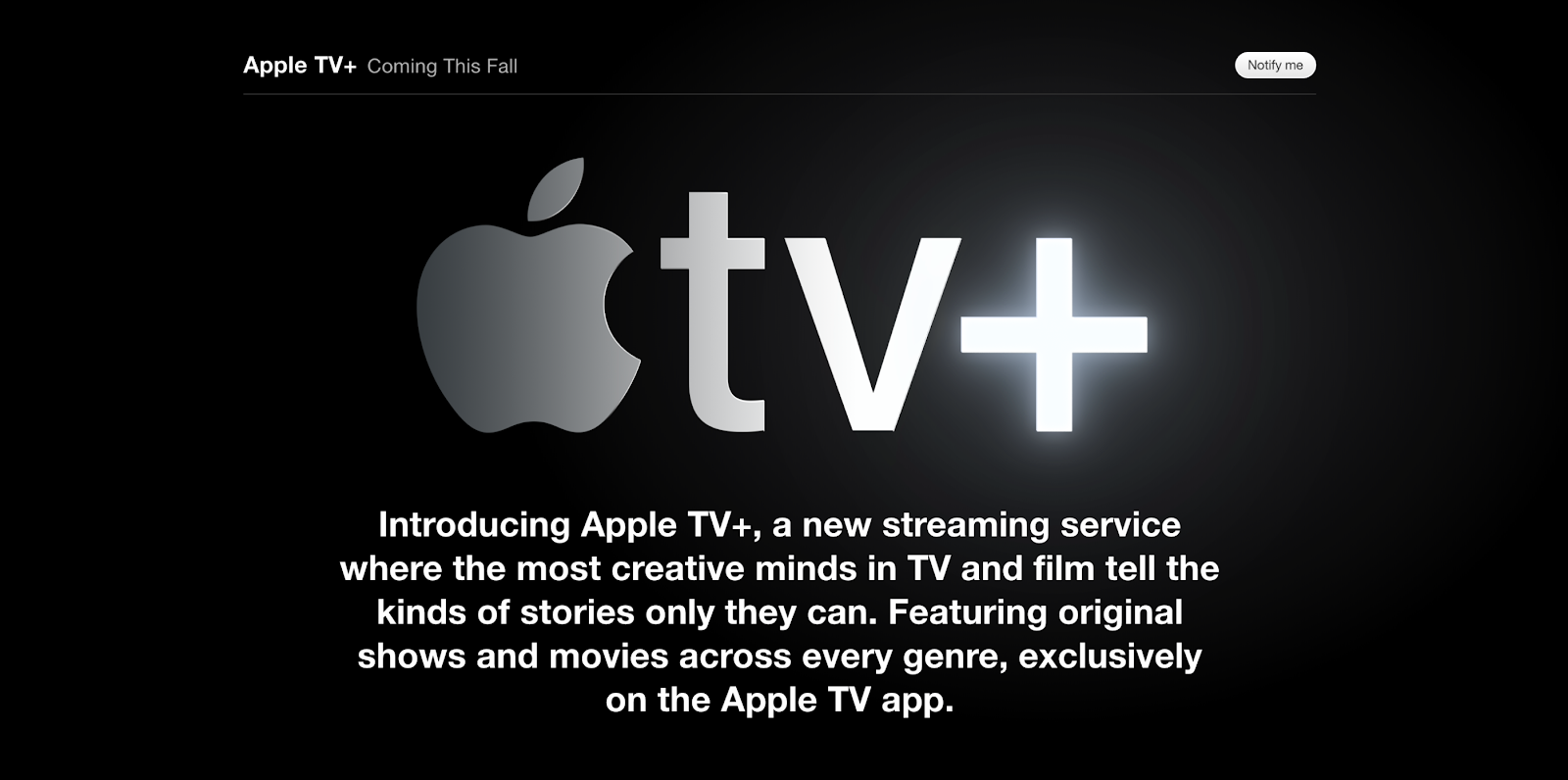
Apple’s Apple TV+ features a solid black background and contrasting white text to tell visitors more about the product. It also features an email capture box and a ‘Notify me’ CTA button.
2. PITCH
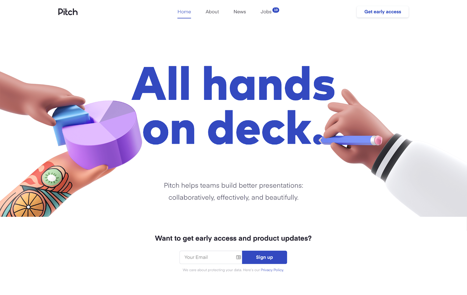
The Pitch coming soon page is beautiful. It features custom-made illustrations, a simple product description, and a signup box where visitors can subscribe to early access and updates.
3. STOPWATCH
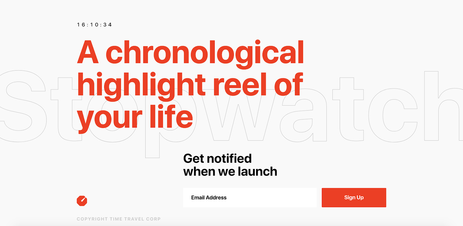
The Stopwatch page is very simple and clear. The heading text tells visitors what the app will be, and the subheading encourages people to share their email.
4. WISTIA BRANDWAGON
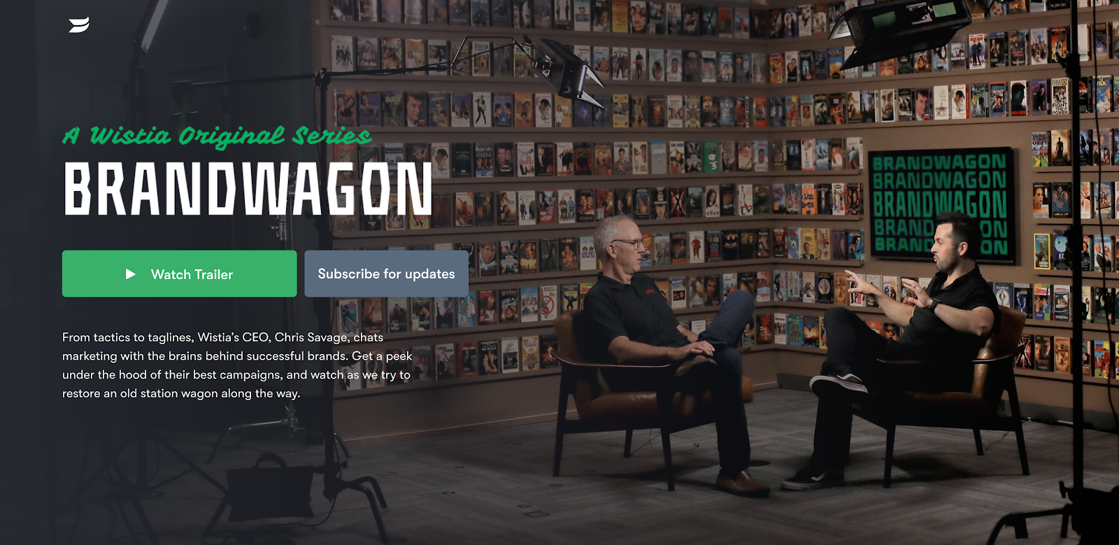
Brandwagon is a video chat show from software company Wistia. Its landing page features two CTAs: The primary CTA is to watch the trailer and the secondary CTA is to capture leads.
5. BUFFER ANALYZE
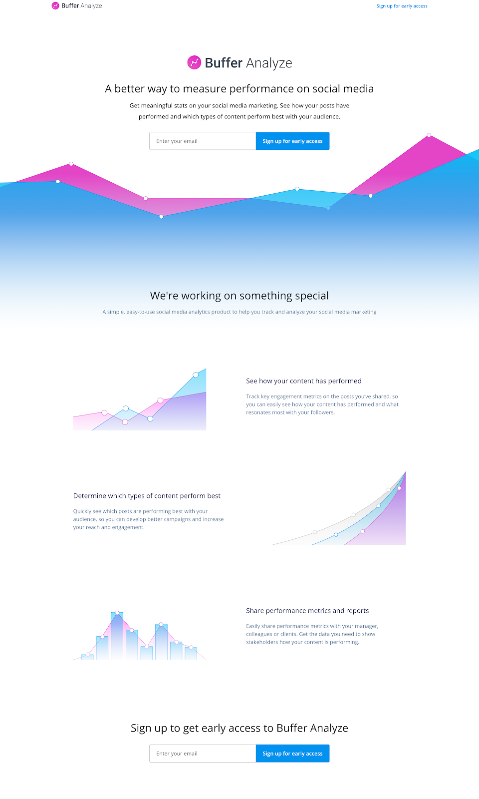
Analyze is an analytics product from Buffer. This coming soon page hints at product features and gives visitors a clear idea of how it will help their day-to-day life at work. It also includes a CTA for early access.
6. MINT
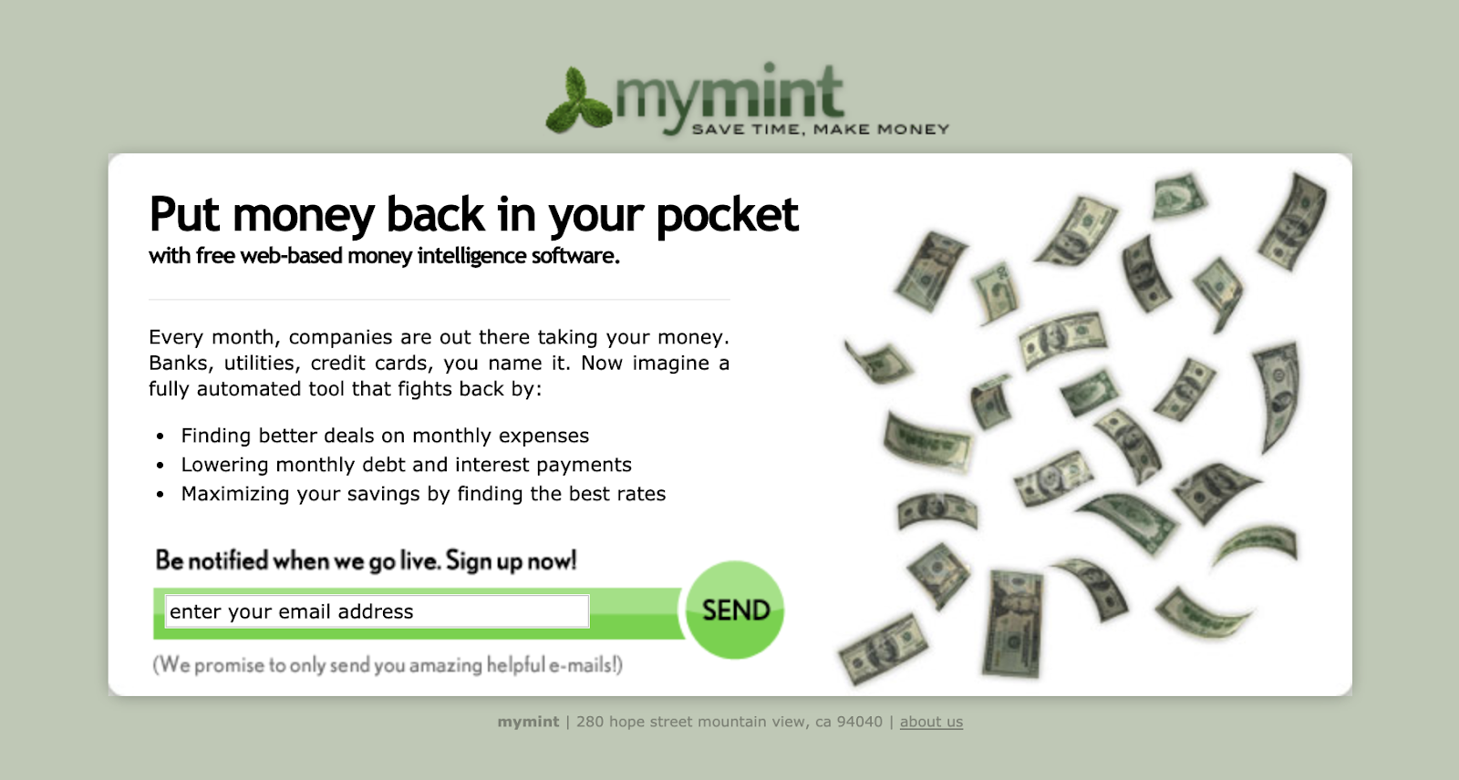
We couldn’t do a roundup of coming soon pages without paying homage to Mint. Noah Kagan (Chief Sumo) helped to grow Mint from zero to 1 million users and this page helped him to test out messaging and capture leads.
7. EQUAL PARTS
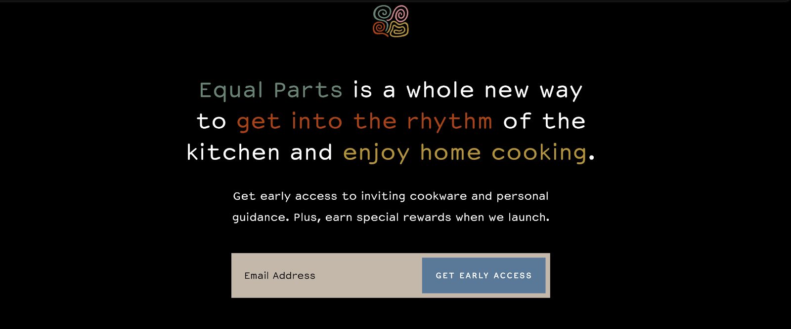
A direct-to-consumer cookware brand, Equal Parts incentivizes signups by offering leads special rewards when it launches.
8. ALLBIRDS (UK)
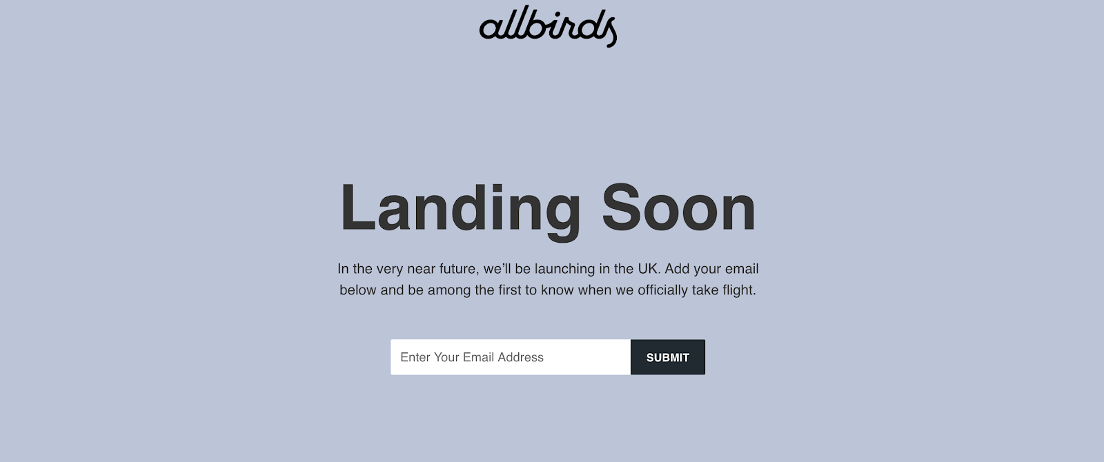
This simple landing page was launched by Allbirds in the UK ahead of the brand’s arrival there. It keeps a fairly standard format with a heading, description, and CTA box.
9. DISNEY+
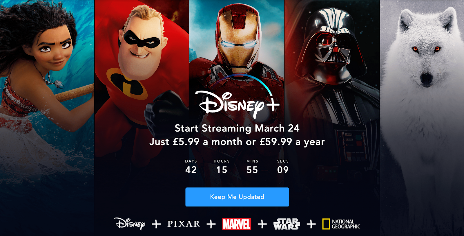
The Disney+ page leans heavily on its brands to capture leads by showing visitors that they will be able to access content from Disney, Pixar, Marvel, Star Wars, and National Geographic on its platform.
10. DROPBOX PAPER
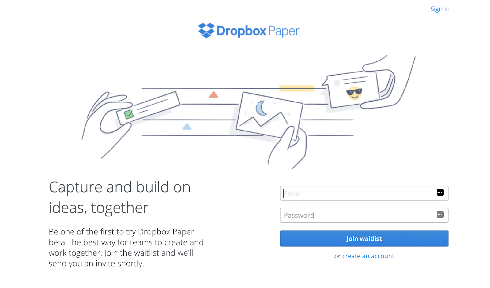
The Dropbox Paper under construction page uses exclusivity to drive leads by saying early signups will “be one of the first to try” its product. In a world where everyone wants to be first, this is a great tactic to try.
11. APPLE ARCADE
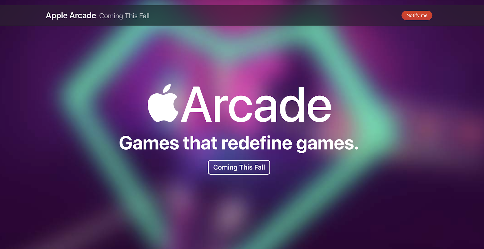
Much like the Apple TV+ coming soon page we featured earlier, the Apple Arcade page features product branding, a tagline, and an email capture box.
12. BYTE
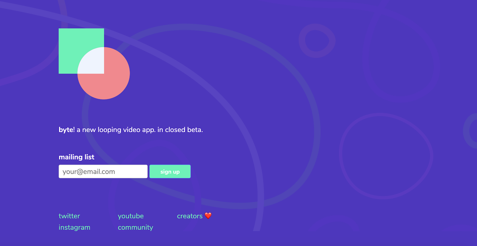
The Byte page is playful and fun with the swirling, circular graphics in the background. It features a simple product description and a CTA box to join its mailing list.
13. EVERLANE
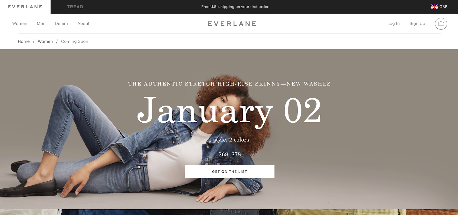
Everlane has a unique approach to coming soon pages and creates one for every new product coming out in its online store. For each product, the coming soon page features the product name, launch date, price and a CTA to join the list to be notified when it launches.
14. FREETRADE
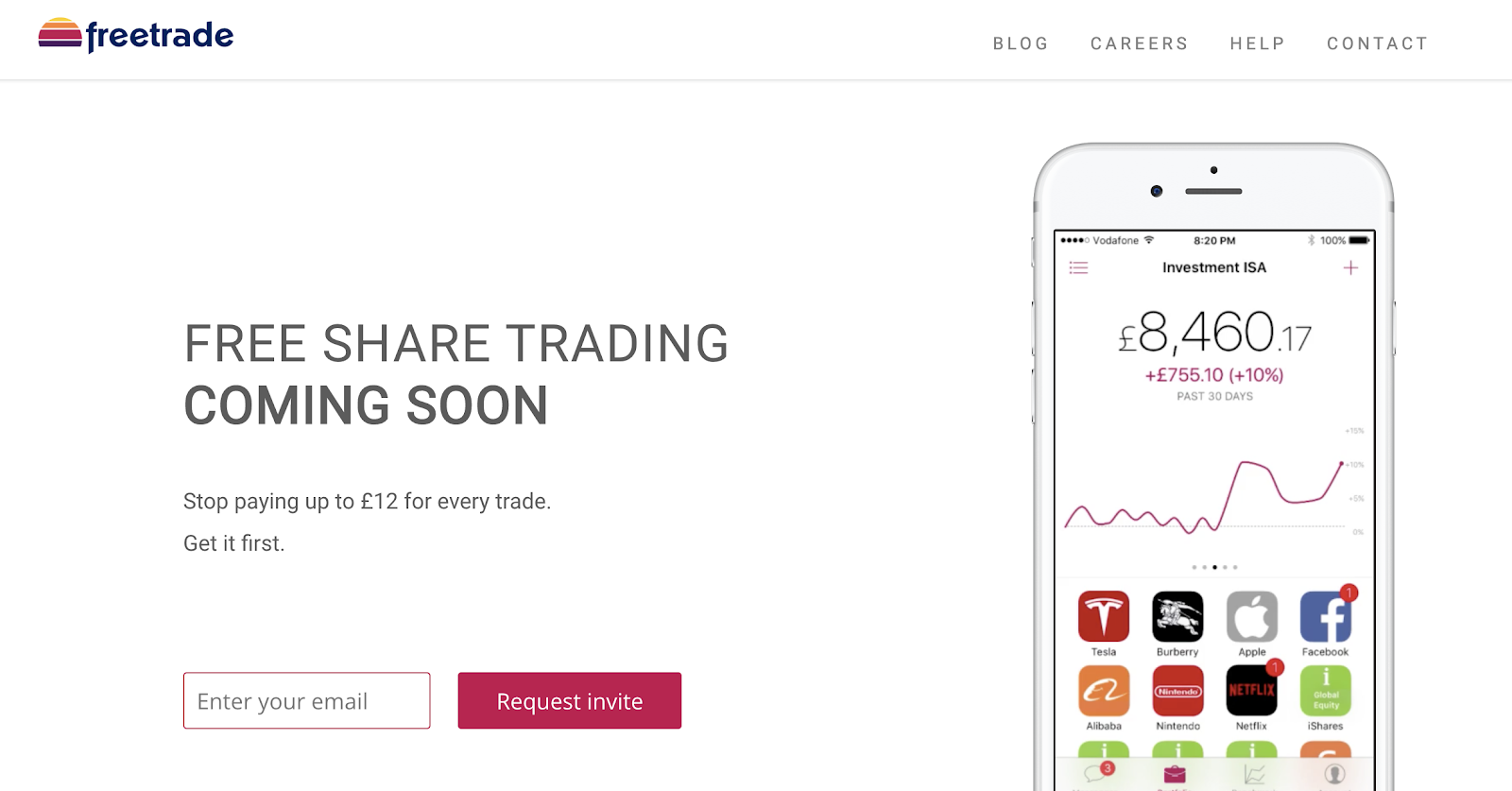
Freetrade chose to showcase its product on the coming soon page alongside a heading describing the app and some paragraph copy that displays the unique selling point of the app.
15. SUNDAYS

Sundays is a dog food brand. Its prelaunch landing page features its logo, a tagline, and an early-access CTA over a video background of dogs and their owners having fun together.
16. QUIP
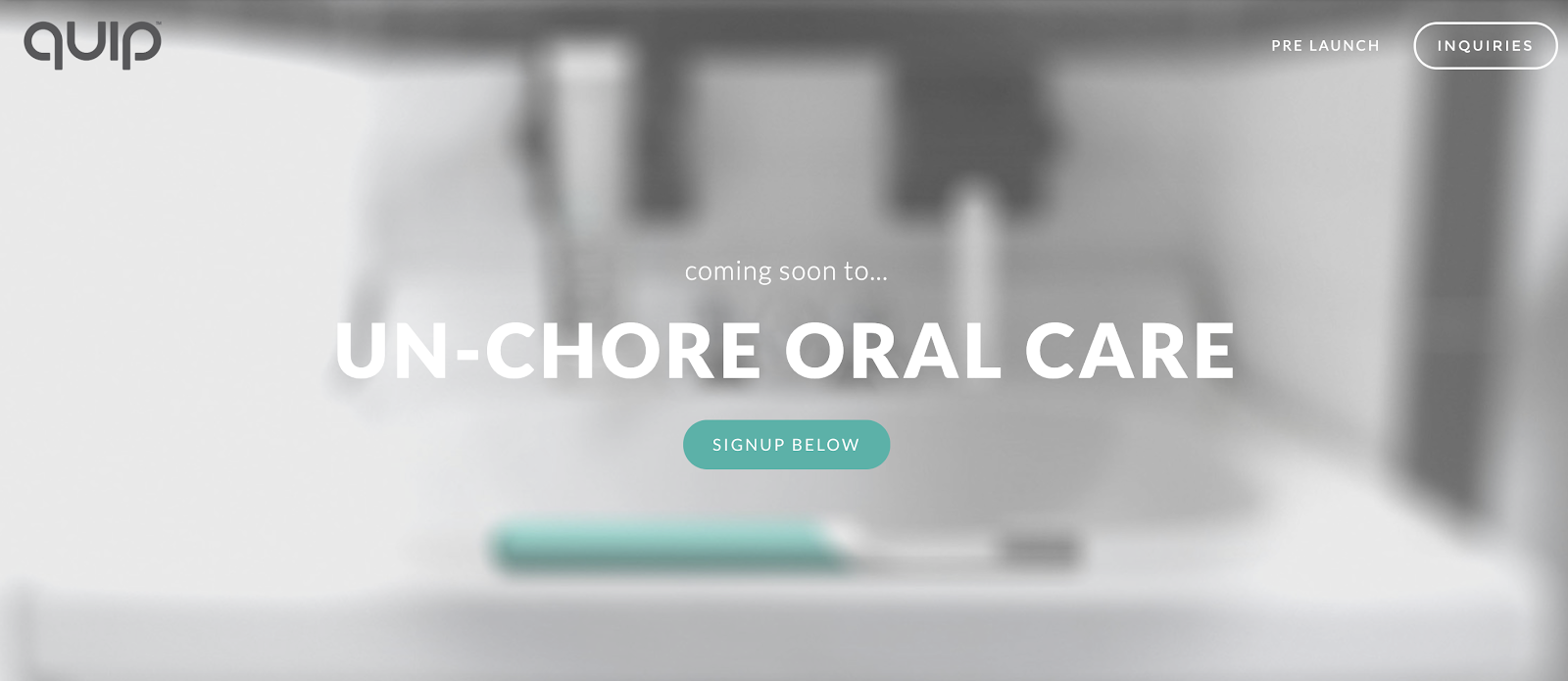
Quip features a blurred background image of its product with its tagline and a CTA button overlaid on the image.
17. SUPERHUMAN
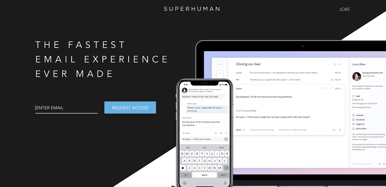
Superhuman features a bold promise on its coming soon page: “The Fastest Email Experience Ever Made.” Alongside this message, it shows images of its product on desktop and mobile and includes an early access CTA.
18. TRANSISTOR
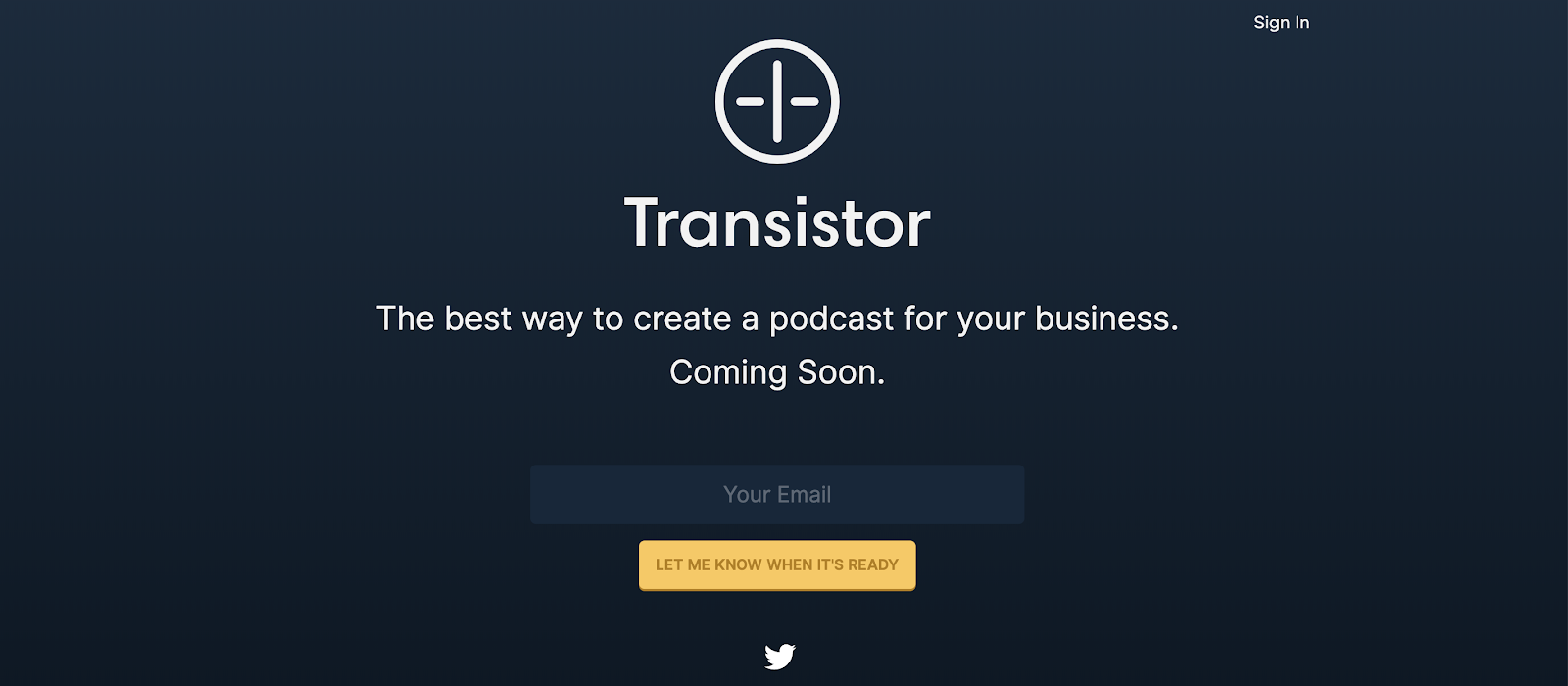
Podcasting company transistor included its logo and a clear message about what its product would be: “The best way to create a podcast for your business.”
19. ROBINHOOD (UK)
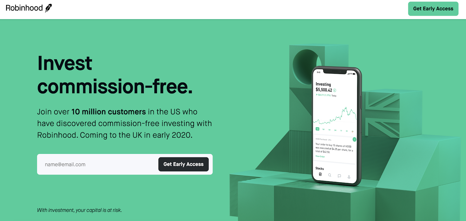
Robinhood created this coming soon page to build awareness about its launch in the UK. It uses social proof by saying over 10 million customers use it in the US.
20. SUPPLY

Supply focused on generating preorders for its shaving product instead of capturing emails. Its simple coming soon page also features an image of its product.
Tools To Help You Launch A Coming Soon Page
When launching a coming soon or under construction page for your business, you don’t have to start from scratch. There are plenty of tools out there to help you, and many even offer templates to get your page built and launched with just a few clicks.
1. CONTENT MANAGEMENT SYSTEMS (CMS)
A CMS enables you to create simple websites and manage the content that appears on each webpage. A CMS can be used to build out a full blog or website, or simply publish a coming soon page.
Pros of a CMS:
- Often easy to set up
- Templates and themes you can use
- Plenty of free advice available to help you get started
- Flexibility to add new features
- Build your full website using the same software
Cons of a CMS:
- You often need to pay for hosting
- Can be a little complex if you’re just building a coming soon page
- May need to integrate with third-party email tools to capture leads
- Plugins might be needed to create a coming soon page
Example content management systems:
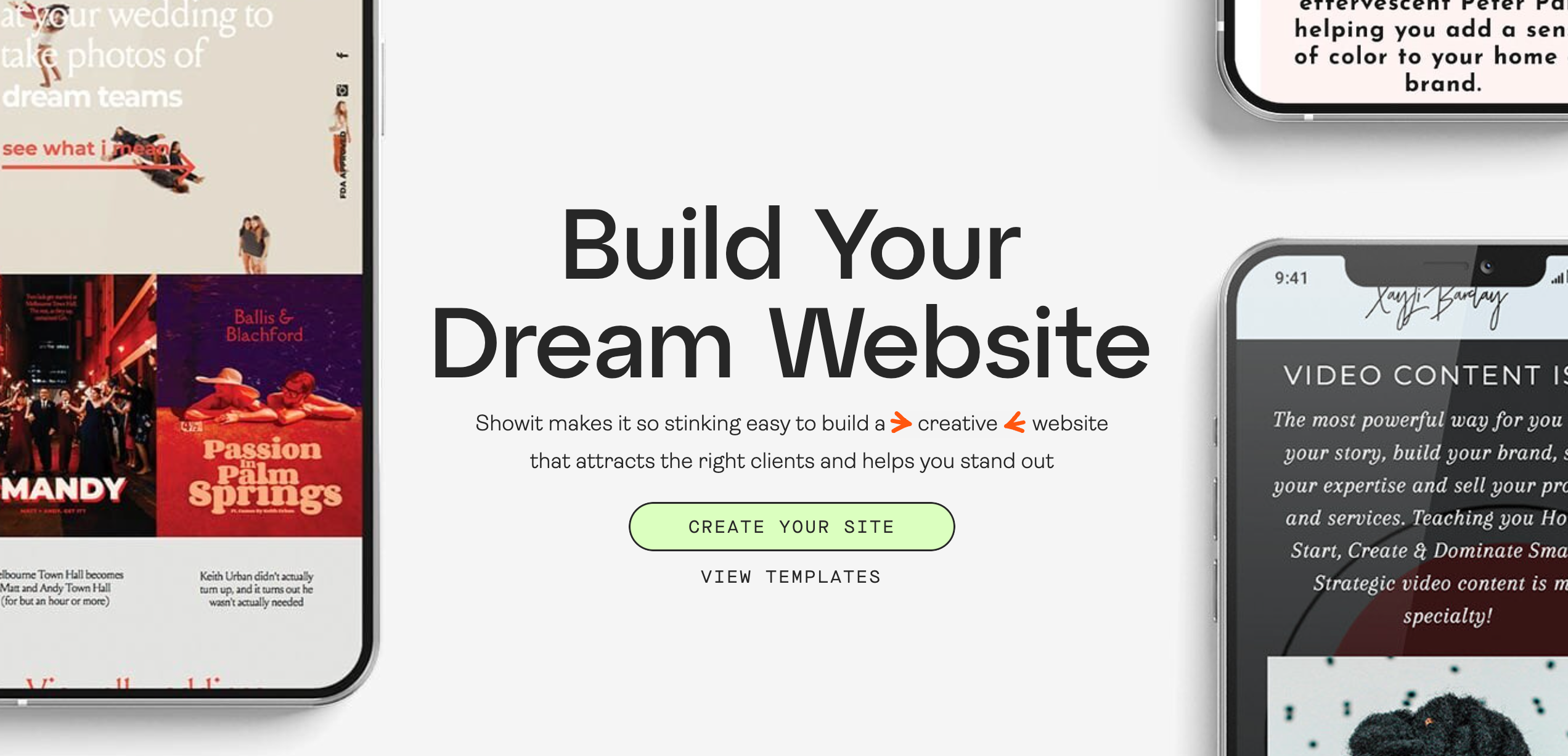
- Showit: Showit’s code-free drag and drop truly allows your website to be as creative as you are.
- WordPress: WordPress is an incredibly popular CMS used by millions of websites worldwide. It’s incredibly flexible and can be used to support blogs, ecommerce sites, agency websites, and more.
- Webflow: Webflow enables anyone to build websites. Its simple interface enables you to quickly put together webpages and even whole sites without needing to code.
2. LANDING PAGE BUILDERS
A landing page builder is a tool that specifically enables you
Pros of landing page builders:
- Quickly create coming soon pages
- Test out different variations to see what messaging and design converts best
- Templates you can use out of the box
Cons of landing page builders:
- Can be expensive
Example landing page builders:
- Unbounce: Unbounce enables customers to create landing pages without code with its simple drag-and-drop page builder tool. It also has a range of templates that can be customized.
- Leadpages: Leadpages features a suite of lead generation and opt-in tools.
3. EMAIL TOOLS WITH LANDING PAGE FEATURE
Some email tools now include landing page builders so customers can create a pre launch landing page and add leads directly to their mailing lists.
Pros of email tools:
- Leads are added directly to your mailing list
- No need to use multiple tools
- Often simple to use
- Many also feature templates you can edit
Cons of email tools:
- Don’t always offer the same levels of customization as landing page builders and CMS.
- Analytics aren’t too in-depth
- Can get expensive once you’ve captured a few hundred leads
Examples of email tools:
- Mailchimp: Used by over 12 million customers, Mailchimp is a leader in the email space and offers a simple landing page builder for your coming soon page.
- Kit: Kit (formerly ConvertKit) is an email marketing tool for creators and has a neat landing page builder to go along with its email product.
- SendFox: SendFox is a simple, affordable email tool for content creators. It lets you create unlimited landing pages (but with very limited layout and design).
Tips for Your Coming Soon Page
Creating a great coming soon page involves a few key strategies. First, keep it simple and concise. Avoid cluttering your page with too much information. Instead, focus on delivering a clear and compelling message that highlights the key benefits of your product or service.
Using a countdown timer can be highly effective. This element creates a sense of urgency and anticipation for your launch, encouraging visitors to sign up for updates. Make sure your page is visually appealing, with a design that reflects your brand’s identity and style. An engaging and attractive design can make a significant difference in capturing visitors’ attention.
Incorporate social media links to connect visitors to your social media accounts. Encourage them to follow you for updates and behind-the-scenes insights, which can help build a loyal following even before your launch. Additionally, optimize your page for SEO by including relevant keywords and meta tags. This optimization can improve your search engine ranking and drive more traffic to your site.
Finally, A/B test and iterate your page. Experiment with different designs, headlines, and CTAs to see what works best for your audience. Use the results to refine and improve your page, ensuring it effectively captures interest and drives engagement.
By following these tips, you can create a coming soon page that not only looks great but also helps you build excitement and capture valuable leads for your upcoming launch.
What Do You Have “Coming Soon”?
Thanks for checking out these examples coming soon pages and tools. You should now have everything you need to give your business the best possible launch.
Today we’ve covered:
- Why coming soon pages are so important
- Some inspiration from brands like Apple, Robinhood, and Buffer
- The tools and templates you can use to get your page up and running
So what are you waiting for? Whatever you have “coming soon”, it’s time to build your page and start capturing some leads for your product launch.
B2B Lead Generation: 5 Strategies Debunked (PLUS Alternatives)
The Best Paid And Free Autoresponder (How To Pick Yours In 15 Minutes)



Add A Comment
VIEW THE COMMENTS