Let me guess.
You want to grow your email list.
So, knowing you need an email opt-in offer for your website, you put your head down and spent sleepless nights creating the opt-in offer to trump all other freebies your competitors created in your niche.
You skipped breakfasts, turned down happy hour invites, and shrugged off plenty of internal freak outs, but you did it.
You launched your opt-in offer for the world to enjoy.
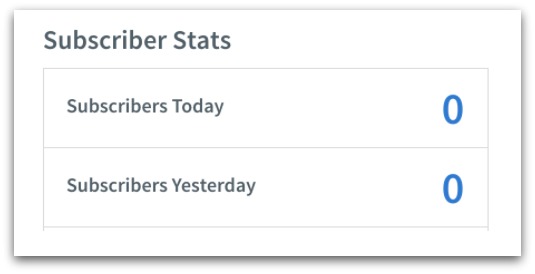
You probably expected to open MailChimp or Aweber to see a bombardment of emails flying your way:

But your reality? Virtual crickets.
So what gives?
- It’s not that your forms aren’t set up properly
- It’s not that your links are 404’ing
- Your email apps are probably set up fine.
You probably just made one of several common mistakes that kill conversions.
Don’t worry, though. They’re not that hard to fix.
In this guide, we’re going to go over each and every possible mistake you could be making so you can start getting the amount of emails you deserve.
Before you dive in, click here to download your free checklist with these 7 mistakes PLUS 34 conversion rate optimization tips to blow up your email list.
Email Opt-In Mistake #1: You Created What Your Audience Needed
When you were creating your opt-in offer, you created exactly what your audience needed, right?
So why aren’t they biting?
The short answer is that people don’t know what they need. And what they want isn’t always what they need.
Think of it this way: if you ran a relationship blog for the 65+ crowd, you might know that your audience needs to try out online dating.
But if they don’t want to try online dating, they’re not going to hand over their emails for your crash course on finding love online.
My first opt-in offer was guilty of this:
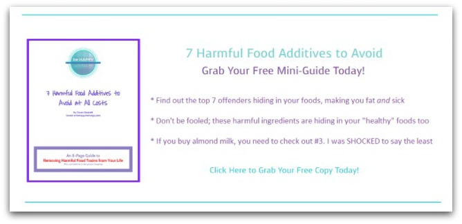
Where did I go wrong? After surveying my readers, I found out that many of them wanted help:
- Finding the time to eat healthy and prepare meals
- Combating their sweet tooth
- Eating healthy though they hate leftovers (and despise meal prep)
- Understanding portion control
So what did I give my audience? A guide about the most harmful food additives to avoid. These chemicals lead to creeping weight gain and monster cravings for junk food.
I knew that if my readers eliminated these additives, they’d rule out one cause for their sweet tooth or issues with portion control.
That’s not exactly what happened.
But I gave them what I thought they needed to solve their problems instead of the information they actually came to my site looking for.
If your visitors aren’t subscribing, then you might be doing this too.
The Fix
With this anecdote of my failure in mind, take a step back and review your opt-in offer with a fresh set of eyes. Criticize your offer from your reader’s perspective.
- Is this insanely useful for my reader?
- Is my offer an immediate solution to their problems?
- Are there actionable steps for them to take starting today?
- Is this information they want rather than just need?
If you missed the mark, it’s time to start over. It sucks, but you’ll thank me later when the emails start streaming in from your new opt-in offer.
But if you’re a rare unicorn who has nailed the opt-in offer and is giving the people exactly what they want… but are still not producing results, then you could be making this next fatal mistake.
Email Opt-In Mistake #2: You Spent Too Much Time On Your Headline
This might sound bold, but…
Creative headlines can actually hurt your conversion rates.
Hear me out:
There is a time and a place for fun, creative titles. They’re just not right for your opt-in offer.
After analyzing 150,000 opt-ins, we found that straightforward headlines outperformed creative ones 88% of the time for opt-ins.
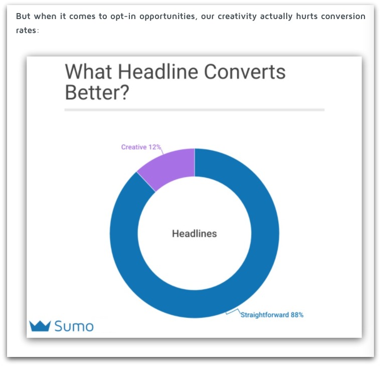
Straightforward headlines performed better 88% of the time.
Here’s what’s really going on.
Creative headlines entice readers and pique their interest.
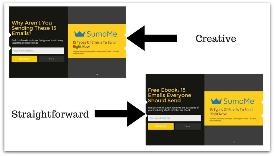
But sometimes (read: most of the time), curiosity isn’t enough for readers to hand over their email address.
If your visitor isn’t 100% sure of what’s in it for them, you’ll have a hard time capturing their contact info.
When you use a clear, direct headline, readers know exactly what they’re receiving in exchange for their email address.
You only have a few moments to capture their interest, so being straightforward takes the guesswork out of seeing what they're getting.
The Fix
Go back to your headline and cut the cute crap.
Do you convey the value of your offer in a straightforward manner or do you dance around the topic hoping to engage your reader’s interest?
Double check that your opt-in form headlines, subheadlines, and call-to-actions are just as straightforward. If you’ve strayed too far into the creative zone, rein it in.
The good news is that direct headlines will take far less time to create so this is one of the easiest tweaks on our list.
Resources: If you need more help crafting the perfect headline, get it in 49 Headline Formulas to Skyrocket Conversions (And Where to Use Them).
Email Opt-In Mistake #3: You’re Not Capturing Your Visitor’s Attention
Pop-ups have a bad reputation.
Back in the day they were seen as annoying, spammy, and potentially dangerous to anyone sensitive to flashing lights.
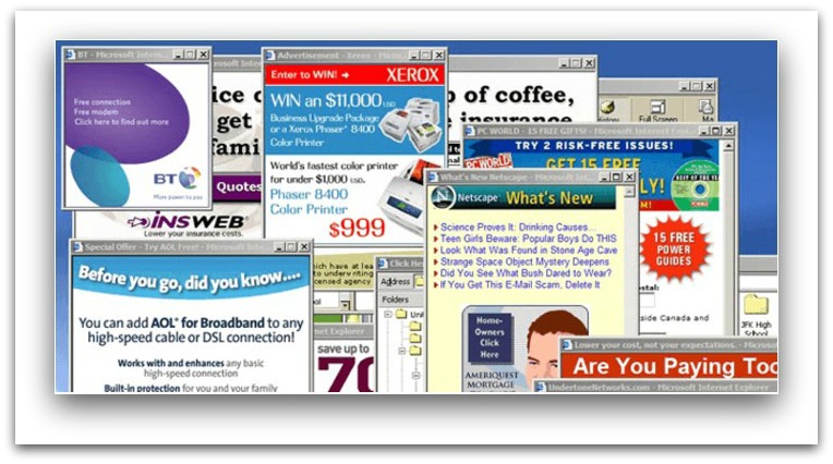
But it’s not 1992 and pop-ups are no longer public enemy #1.
In fact, pop-ups can double and triple your opt-in conversion rates. We’ve seen this specifically when our users take advantage of our free List Builder app.

But it’s not as simple as download, set and forget, and voila! Magic. Just like I mentioned earlier, it’s up to you to take this to the next level.
Enter: Click Triggers.
You’re far more likely to convince someone to help you out with a larger request if you ask for a smaller one first.
Instead of asking for an email address right away (large request), make a smaller ask first (like clicking a link):
Have your readers click a “Join” link and when they do, greet them with a thoughtful pop-up.
Here’s an example of how our Content Sumo Sarah uses it on her personal blog Unsettle:
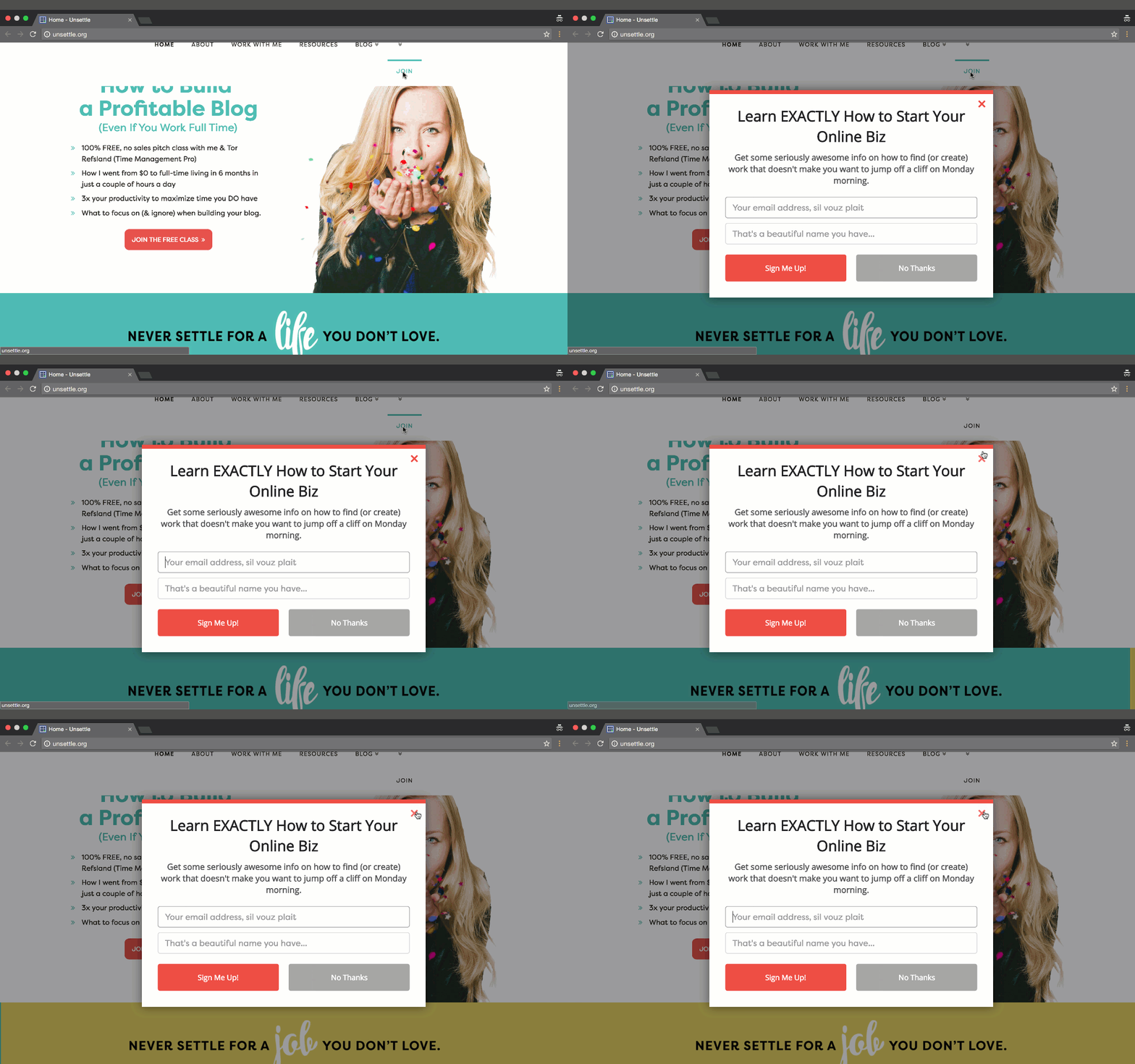
It’s attention-grabbing, and works off of the marketing psychology principal of the “foot in the door” technique.
The Fix
Don’t be afraid to play with pop-ups and use List Builder.
If you’re concerned about your pop-ups annoying your reader when they first land on your site, you can use a Click Trigger like Sarah used above.
Alternatively, List Builder has a feature to give your readers a specific amount of time on your site before one appears, or choose a “Smart” mode.
Smart Mode works as an exit-intent pop-up – the pop-up appears when your visitor is leaving:
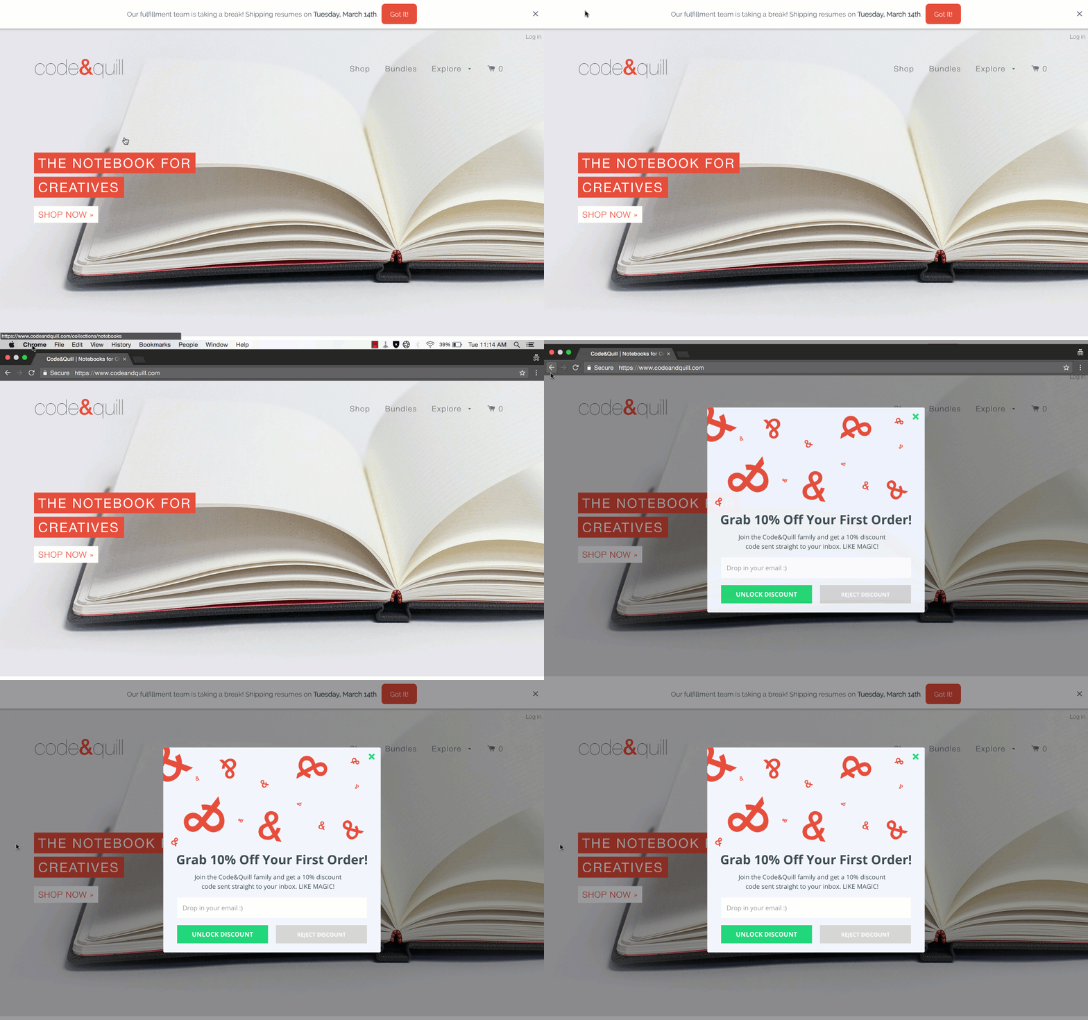
Guaranteeing the most conversions with the best user experience.
In the end, if you’re not using pop-ups for your opt-in offer, you’re going to see dismal opt-in rates at best.
Email Opt-In Mistake #4: Your Opt-in Form Is Asking for TMI
Have you ever had to fill out a form like this one?
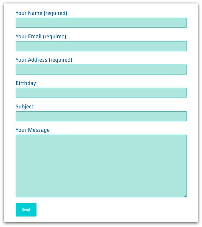
I have news for you…
Just one extra question on your opt-in form has the potential to distract and turn off your readers so much that they bounce.
And what if that one extra question was simply asking for their name in addition to their email address? You could still be hurting your conversion rates.
Imagescape dropped their contact form fields from a whopping 11 down to 4 and saw a 120% jump in their conversion rate.
It makes sense, too. If you ask for a ton of information, you’re making your audience work to get on your list.
The Fix
Keep your email sign up forms super simple and only ask for an email address.
We take this approach in our Welcome Mats on all the content upgrades on our guides:
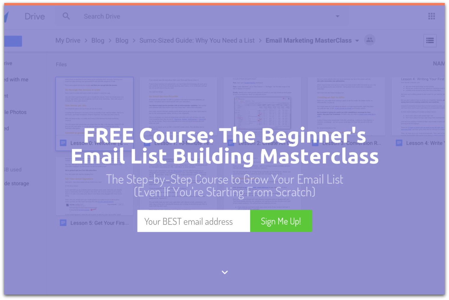
And we convert at an average of around 13-15%:

Even though you’re requiring less, you’ll increase your opt-in rates and simultaneously reduce the amount of fake names you receive.
Email Opt-In Mistake #5: You Failed To Test What Your Visitors Respond To
Be honest…
Do you have the data to back-up the choices you’ve made when offering your opt-in offer?
I don’t mean this type of data:
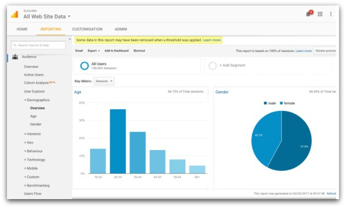
I mean the type of data that tells you whether your audience responds to one headline over another, or whether they’re more likely to click a green button rather than a red one.

If you haven’t been A/B testing everything, I’m going to take a stab in the dark and say probably not.
And you’re taking a stab in the dark at what works with your audience. Which could be leaving a metric ton of conversions on the table.
By A/B testing, you may find that one button color goes unnoticed by your readers while another inexplicably attracts them like ravers to a pack of glow sticks.
WiderFunnel uncovered that employing a big orange button led to an increase in conversion rates by 32.5%. Who would have guessed that?
And back in 2011, HubSpot discovered that a red button converted readers more than a green one did by 21%. All from a simple button color change.
Resources: When you're setting up your A/B tests, don't mess it up. Find out how to run the perfect A/B testing framework and avoid these silly A/B testing mistakes.
The Fix
With Sumo, you can run as many A/B tests as you want for free through List Builder, Scroll Box, Smart Bar and Welcome Mat.
Focus on one item at a time and decide on a goal before you start experimenting. It’s exciting to rush into the fun zone of experimentation, but take a strategic approach.
You can also use Heat Maps (free) to see how your tweaks are performing:
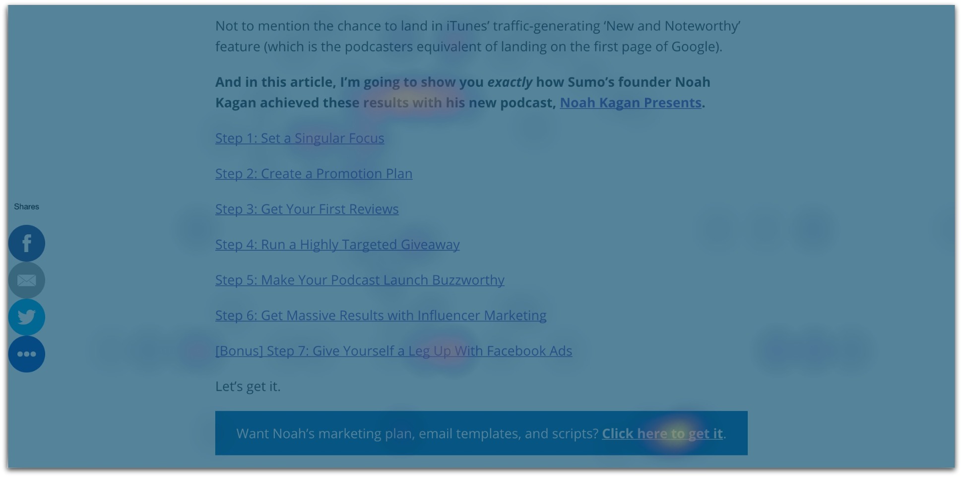
By comparing where your users are actually going on your site, you can identify what specifically catches their eye and what goes unnoticed.
Email Opt-In Mistake #6: Your Design Is Snooze-Worthy
Visuals increase the chance that people will actually read your content by an astounding 80%.
So if you’re trying to make an impression by using a plain ol’ opt-in form without a single image, you should expect a bleak conversion rate.
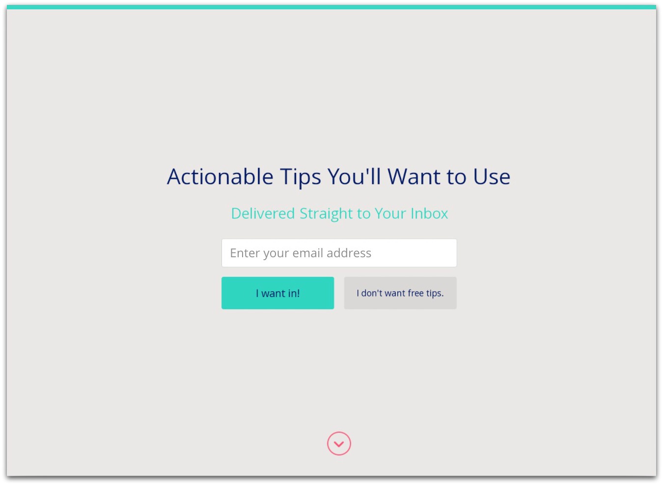
Even simple design changes are enough to spike noticeable boosts in your conversion rates.
Highrise found that without an image, they got 102.5% fewer opt-ins.
The Fix
Start with quick changes like switching up the color of your button or using a visual image to help convey your message.
Already have an image for your background? Consider testing an alternative one.
Highrise’s marketing team found that not only adding an image increased their opt-ins by 102.5%, but swapping out one person for another in the background image increased conversions further by nearly 5%.
This is one simple change that yields powerful results.
You can do this in three ways:
1. Add an image of what the readers will get with their offer.
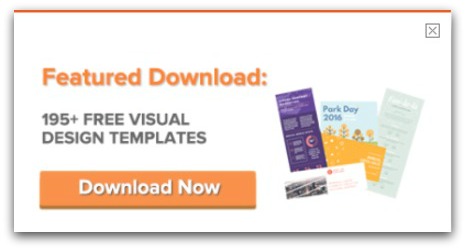
Think: a small picture of the ebook cover or a graphic of the templates themselves like what HubSpot did in this pop-up:
2. Use a background image.
Set an image to the background of your opt-in form.
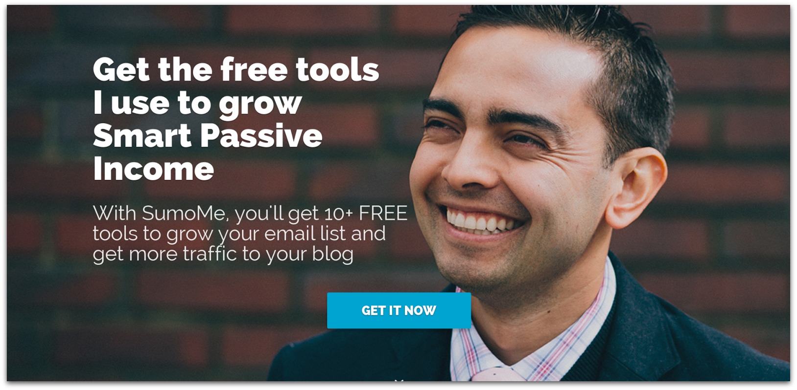
Visually appealing forms with human faces not only capture our attention but they also build trust at the same time.
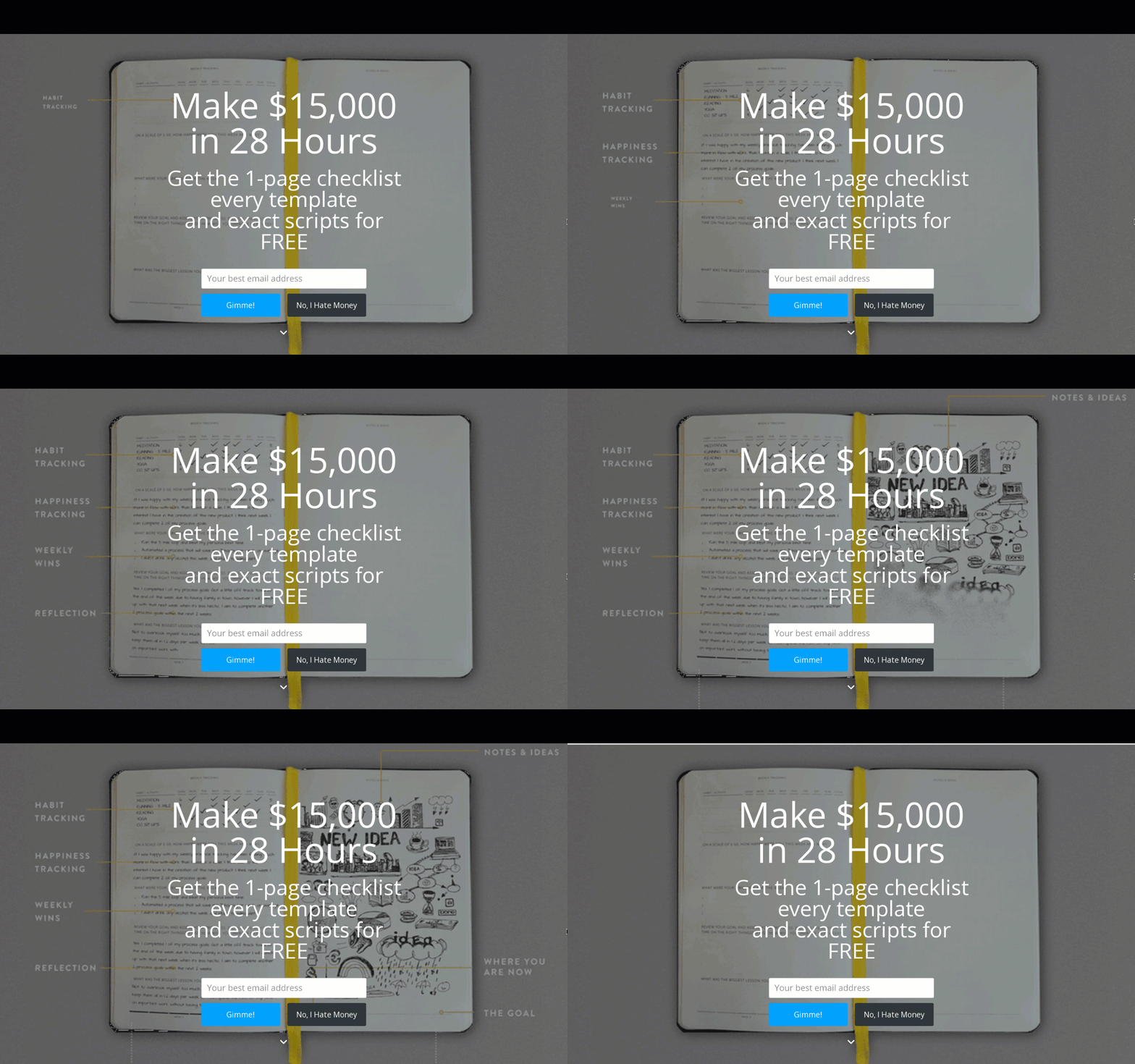
3. Add some movement.
In this example, the motion in the background captures your attention while the bold headline and bright button shouting Gimme! help guide you to making the next move.
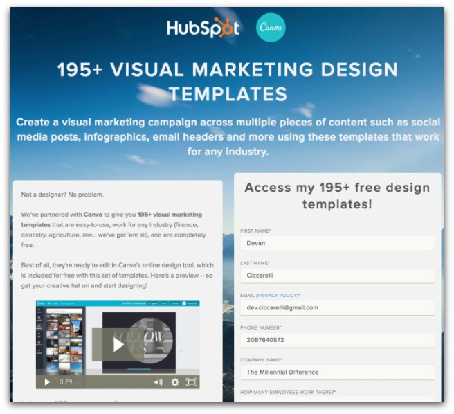
For even more fun, let’s study this HubSpot one that matches the simple pop-up in our first example:
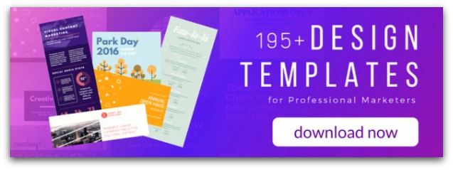
If you look closely, you’ll notice that the background image is also a sneak peek of what readers will get when they click the button, in addition to the graphics displaying this in the foreground.
Finally, this example utilizes the “foot in the door” technique. Readers are not prompted to enter their email address right off the bat. All they have to do is click the innocent “download now” button.
And if they’re hesitant, there’s plenty of benefit-driven copy to nudge them back to their initial gut decision:
So get to designing your visuals and don’t look back.
Resources: Create the perfect landing page and opt-in offer design so you don't give up tons on conversions.
Opt-In Offer Mistake #7: You Haven’t Built Up Enough Trust
You may tackle the first six reasons in this guide like a pro, but if you can’t master our final one, the rest will be worthless.
Without trust, you have nothing.
And for readers to give you their email address, you must gain their trust. One of the best ways to convey trust is through social proof.
For example, testimonials are a form of social proof that can increase conversions by 35%. They reduce the risks for your potential customer by reassuring them that others have (successfully) tried your product or service and overwhelmingly loved it.
Don’t just leave testimonials for your website, though. Include one or two strong ones in your opt-in, too.
Logos from brands you’ve worked with in the past also strengthen your credibility. Lewis Howes does a killer job of this with his opt-in:
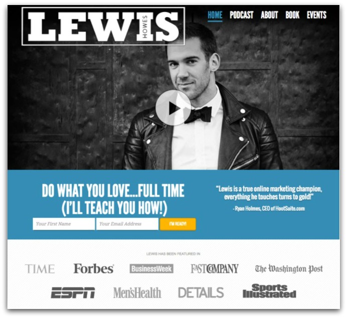
On the right-hand side, you’ll notice a testimonial. Then it scrolls through to show one endorsement after another.
Plus, he’s strategically placed a plethora of logos just below the place he’s asking readers to commit to. This reaffirms that he’s trustworthy right where it matters.
The Fix
Many people know that building trust is critical for their websites, but few build this level of trust in their opt-in forms.
This is when you’ll be asking your potential subscriber for their personal information so now’s the time to bust out those trust symbols.
Look for short testimonial clips or client logos that you could use and sprinkle them around strategically on your opt-in forms.
Resources: Not sure how to use social proof in your offers? Find out the 13 types of social proof here, and how to build up social proof if you're starting from scratch.
Stop Making These 7 Ridiculously Simple Mistakes TODAY
Now that you have all the info you need to put those opt-in offers of yours to work, it’s time to get moving. Don’t just sit there with analysis paralysis.
- Start by reevaluating the value of your opt-in offer first. Have you conveyed an offer that people actually want, not just what they need? If the answer is no or even maybe, head back to the drawing board.
- If you correctly identified a solution to your reader’s problem, move on to switching your creative headline for one more straightforward, reducing the number of required fields in your form, and using a pop-up for your readers when they land on a certain page.
- After that, start A/B testing everything to make sure your hunches (okay, well-educated guesses) are in fact helping your conversions.
- Next, focus your attention on your design and building trust. Strike a happy balance that conveys your sense of aesthetics and reaffirms your credibility without overwhelming your website visitor.
And don’t be afraid to re-test everything again afterwards.
By tackling these 7 items, and continuously testing them, you’ll finally start reaping the bragging rights that come standard with high opt-in conversion rates.
Want to squeeze every last email from your website? Click here to download a FREE checklist with these 7 mistakes PLUS 34 conversion rate optimization tips to blow up your email list.
Add A Comment
VIEW THE COMMENTS